
Where ideas come to life
Wavenwood Studio is a fresh creative agency with a passion for design, storytelling, and helping brands stand out. Our portfolio is a mix of projects that show what we can do, from branding and websites to social media and custom creative work.
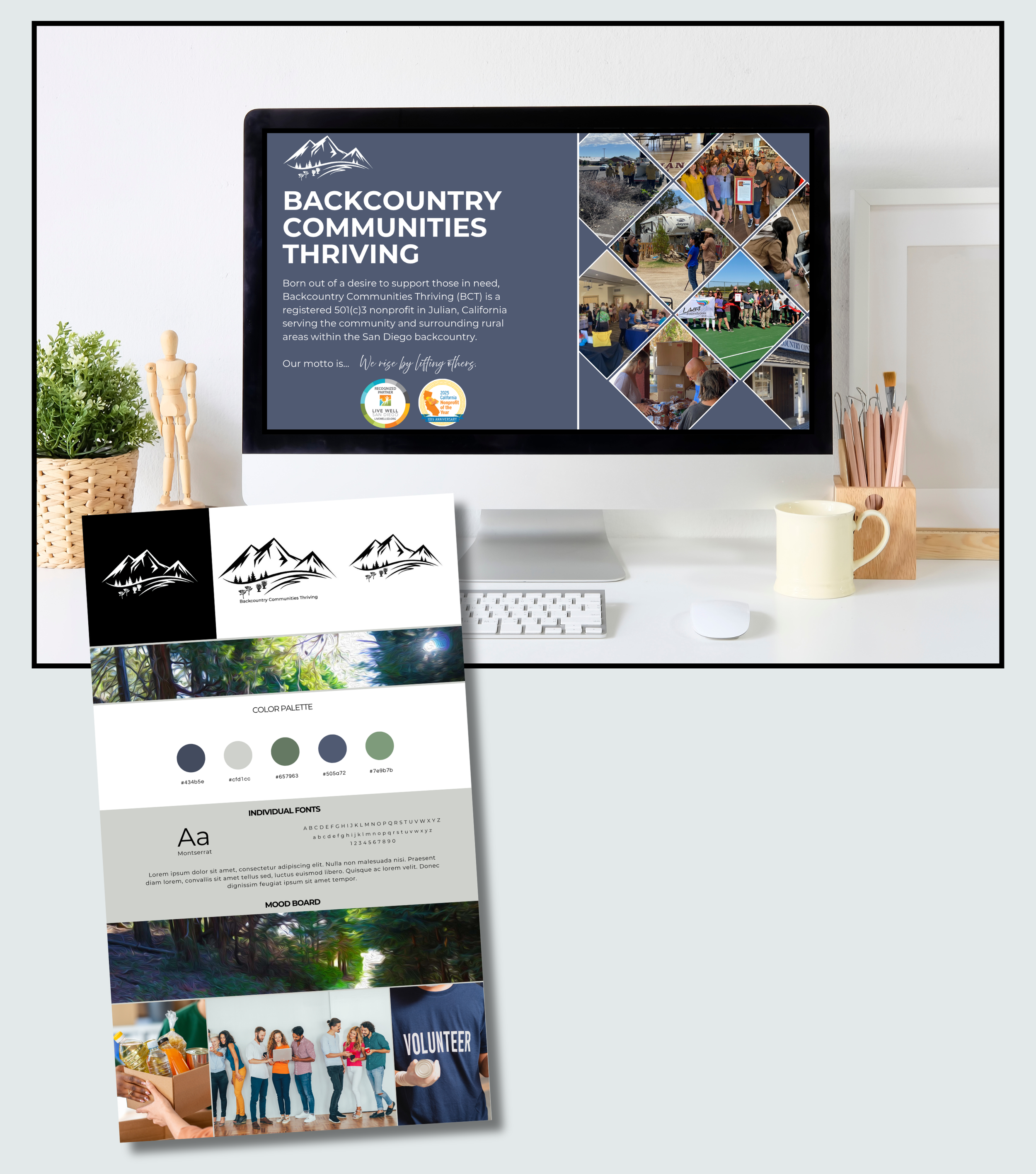
Client: Backcountry Communities Thriving - a nonprofit organization serving a rural area.
Problem: The client’s existing website was too playful and didn’t make their work, lacked a clear voice and contained too many pages. The visitor was often left with no clear direction as to the organization’s focus.
Vision: The client wanted to utilize colors from a favorite photograph in their office to rework their website with a more polished look and fewer webpages.
Approach: We pulled key colors from the photograph to represent the rural area that the organization serves (mountains and desert). Repetitive web pages were removed or combined to provide a more streamlined appearance. A clear call to action, in this case to donate or volunteer, was added to the home page. Photographs of the client’s work and events were added to tell the story of the community that they support. Awards that the client has received were also added to highlight their accomplishments.
Results: Visitors are now greeted with clear messages about the client’s services and important available resources or information that organization is sharing. Donors are now able to visualize how their money is spent through the client’s photographs. The client has reported an increase in traffic to their website for information about their organization.
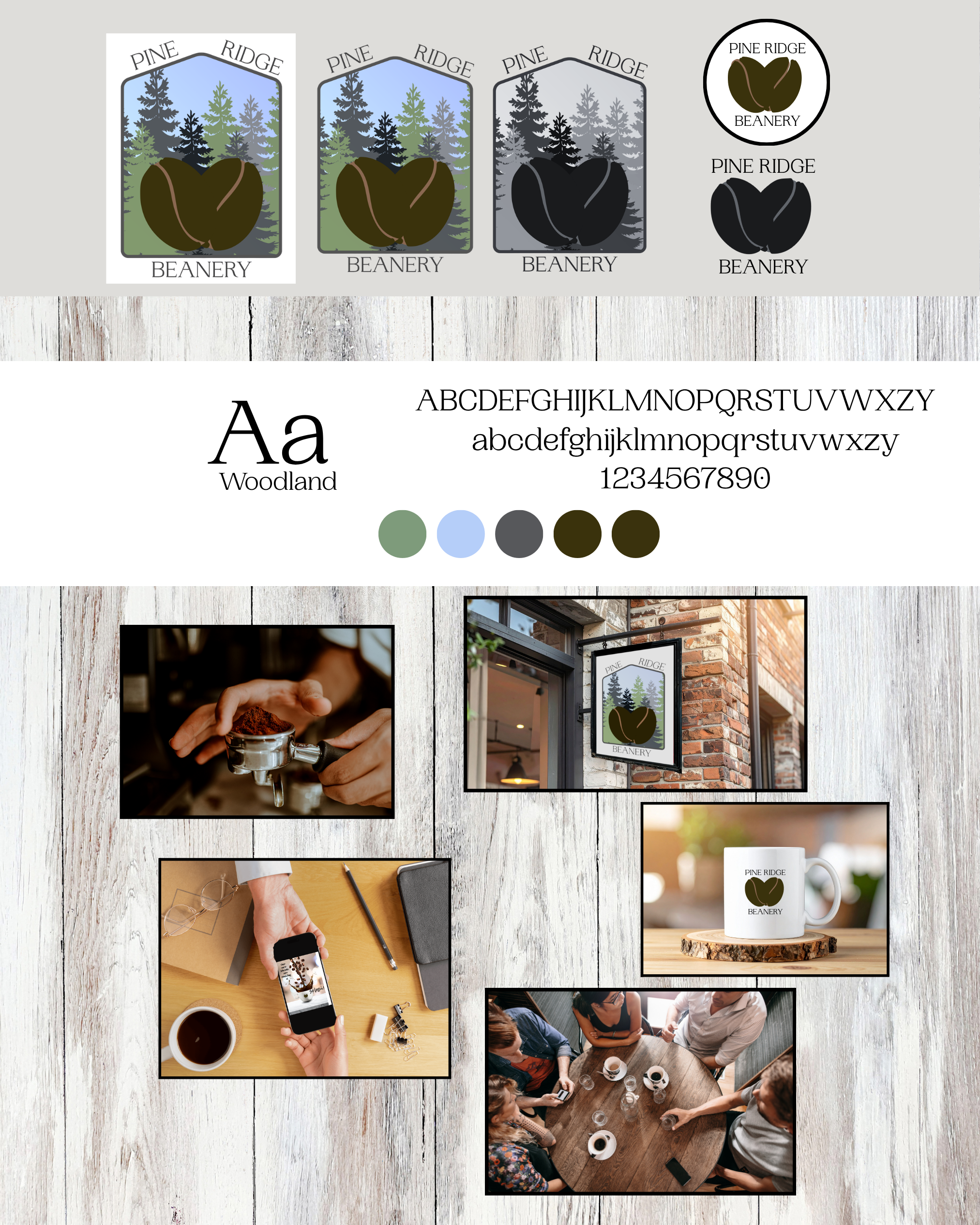
Client: Pine Ridge Beanery - mountain-town coffee shop located in a small outdoor community. The café focuses on locally roasted coffee, fresh pastries, and creating a welcoming gathering space for locals and visitors.
Problem: The client needed a recognizable brand identity, consistent social media content and marketing materials for events. The brand needed to feel warm, rustic, and connected to the surrounding landscape.
Vision: The goal of this project was to develop a cohesive brand identity and digital presence that reflects the café’s cozy, nature-inspired atmosphere while helping attract both locals and tourists.
Approach: Wavenwood Studio developed a cohesive visual identity and marketing system designed to highlight the café’s personality and build community engagement. Deliverables included a logo design, professional photos and social media content templates.
Results: This project demonstrates how thoughtful branding and consistent visual content can help small businesses build a recognizable brand, create a welcoming online presence and promote events and seasonal offerings.
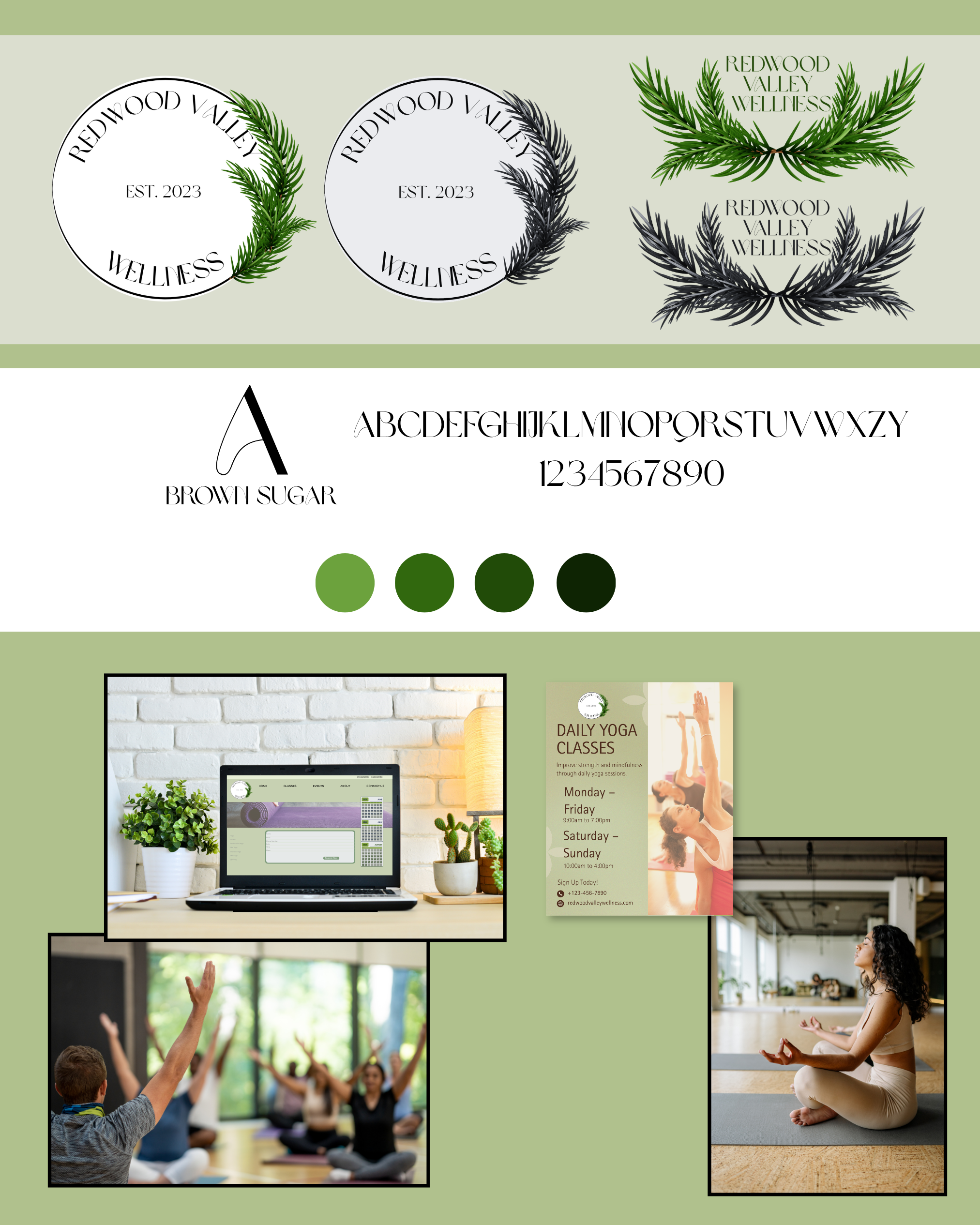
Client: Redwood Valley Wellness - a community wellness center offering yoga, Pilates, and tai chi classes alongside therapeutic massage services. Located in a quiet natural setting, the center aims to provide a peaceful space where people can restore balance, improve mobility, and reconnect with their well-being.
Problem: Redwood Valley Wellness had excellent instructors and a beautiful location, but their marketing materials and online presence didn’t reflect the calm and professional atmosphere of the center. Key challenges included an inconsistent visual identity, social media that lacked cohesive branding and a website that didn’t clearly communicate offerings or encourage bookings.
Vision: The goal was to create a brand and digital presence that reflected the center’s tranquil environment and holistic philosophy. The new identity needed to feel calm and welcoming and professional yet approachable. The visual language drew inspiration from the surrounding landscape - soft earth tones, natural textures, and minimal design elements that mirror the peaceful atmosphere of the wellness center.
Approach: Wavenwood Studio developed a cohesive visual and digital system designed to support both discovery and client engagement. A new logo and brand palette were created using natural greens and warm neutral tones inspired by forest landscapes. The typography combines soft elements with clean, modern text for readability across digital and print materials.
Results: The new branding and digital presence helped Redwood Valley Wellness better communicate the value of its services and the peaceful experience it offers. The updated brand and website now provide a foundation for continued growth and stronger engagement with the local wellness community.

Client: Backcountry Communities Thriving - a nonprofit organization serving a rural area.
Problem: The client needed new brochures for their organization to clearly explain their services. As a community-based nonprofit that provided a variety of services for their residents, the organization was lacking a straightforward approach to defining their focus.
Vision: We partnered with the client to design a set of professional, visually engaging brochures that highlight their services and connect with their target audience. The goal was to create a print piece that not only informs but also inspires action.
Approach: Our team developed a clean, easy-to-navigate layout paired with calming imagery and concise, persuasive copy. The brochures were printed on high-quality, matte-finish stock for a polished and durable feel, ensuring they make a lasting impression at events, meetings, and community outreach efforts.
Results: The final design successfully reflects the client’s mission, reinforces their brand identity, and provides an effective marketing tool that is as functional as it is beautiful.
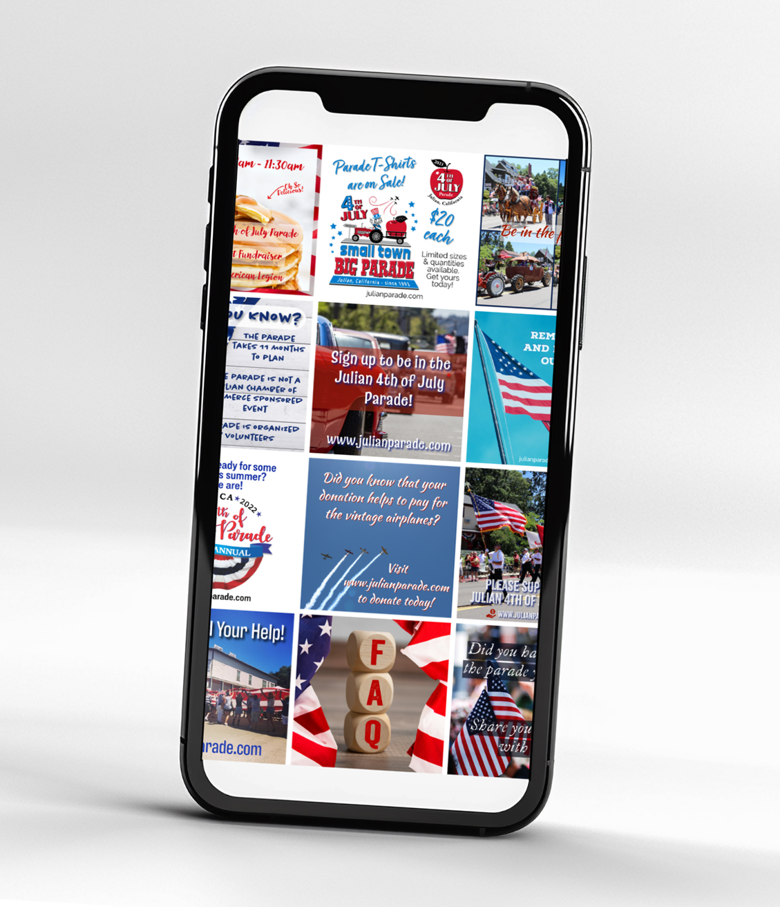
Client: Julian 4th of July Parade, Inc.
Goal: Increase community awareness, boost parade attendance, and highlight sponsors, participants, and volunteers through engaging, timely, and visually appealing social media content.
Vision: To create a festive, community-centered online presence that captures the excitement of the event, builds anticipation leading up to parade day, and strengthens pride in this long-standing local tradition.
Approach: We developed a strategic content calendar, blending colorful, patriotic-themed graphics with informative and engaging posts. We featured participant spotlights, sponsor recognitions, and behind-the-scenes glimpses of preparations. On parade day, we provided real-time coverage through photos, videos, and live updates to share the energy with those both in attendance and following online.
Result: The campaign significantly increased post engagement, expanded the organization’s online following, and contributed to a noticeable rise in parade attendance and sponsors. Participants reported increased visibility, and the community responded with overwhelming enthusiasm both online and in person.
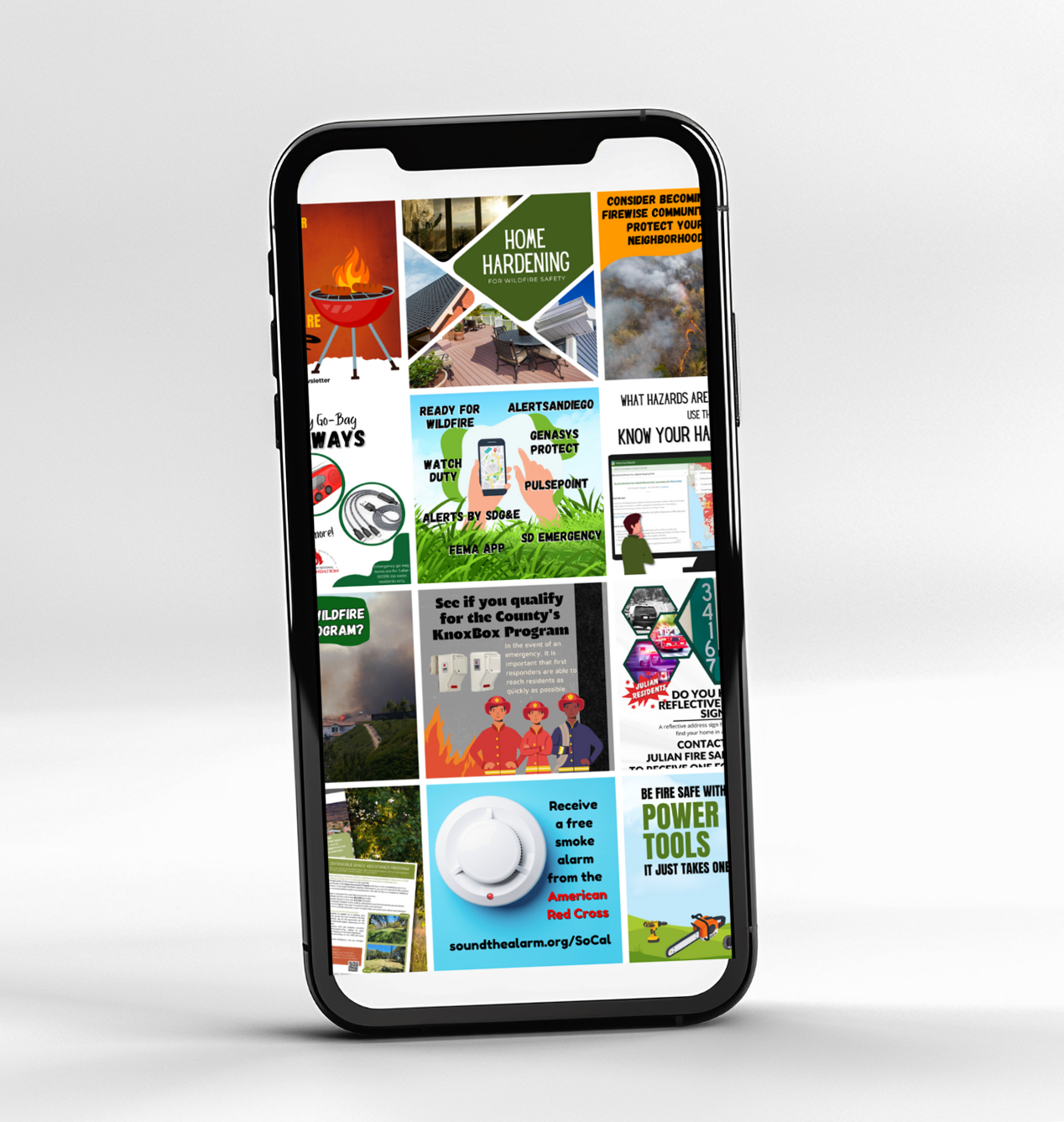
Client: Julian Fire Safe Council
Problem: The client was lacking a social media presence. They needed a platform to share wildfire safety tips and educational messages throughout their community.
Goal: The goal was to create visually impactful imagery and messages to grab the audience.
Approach: Our work included creating a consistent posting schedule, designing branded graphics, writing clear and engaging captions, and curating timely content on wildfire preparedness, local events, and safety tips. We also developed seasonal campaigns that highlighted key initiatives and community workshops, ensuring the council’s messaging was both informative and approachable.
Results: Through a blend of education and engagement, we helped the council grow their online reach, strengthen community trust, and provide residents with resources that could save lives during wildfire season.
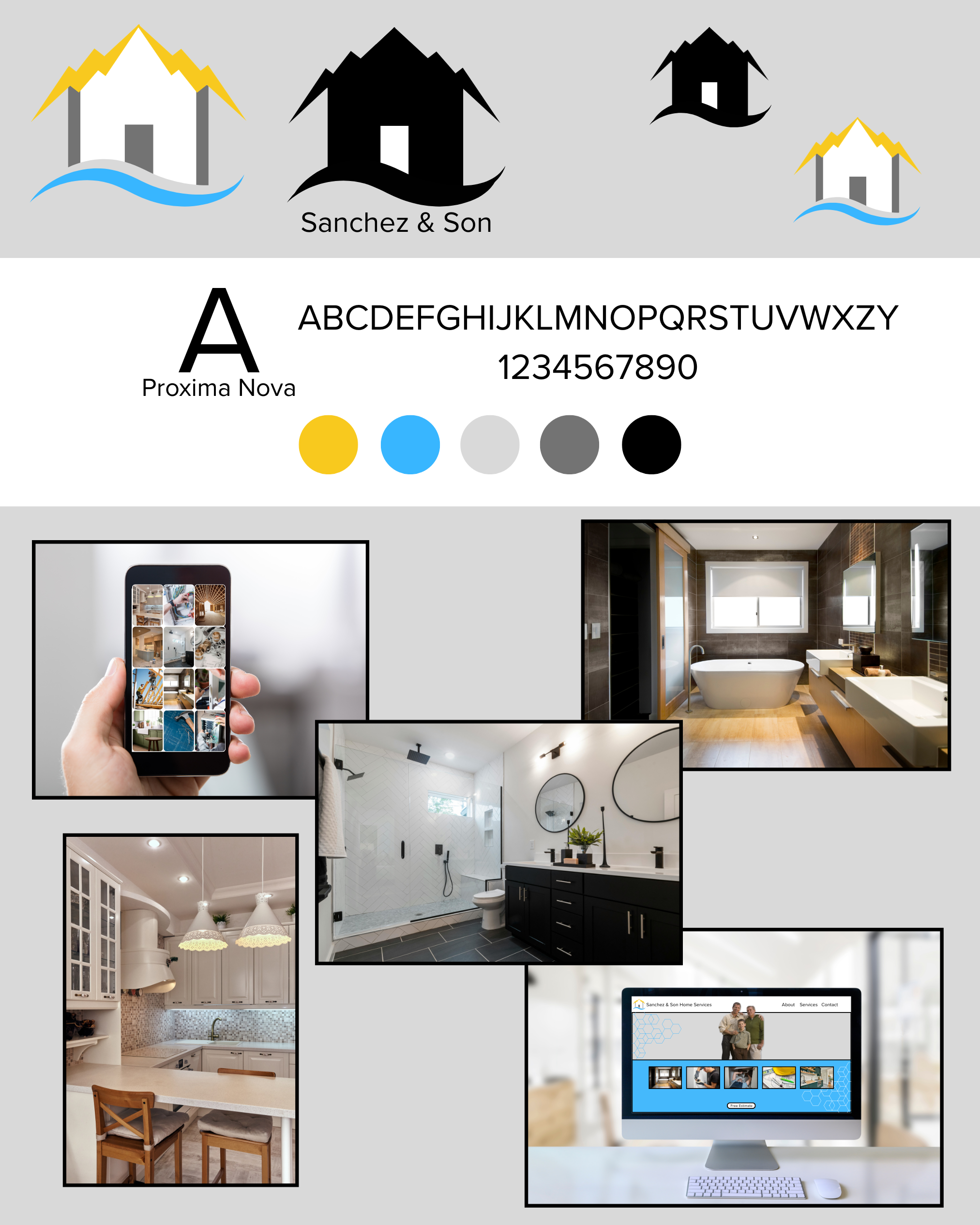
Client: Sanchez & Son Home Services - a family-owned construction and home repair company operated by a father-and-son team. The business provides a range of residential services including home construction, remodeling, plumbing, and electrical work.
Goal: Known locally for reliable craftsmanship and honest service, Sanchez & Son built their reputation through word-of-mouth referrals. As the company began taking on larger projects, they wanted a stronger brand presence and a professional online platform that reflected the quality of their work.
Vision: The goal was to create a professional brand identity and online presence that reflected the company’s reliability, craftsmanship, and family roots. The new brand needed to communicate trust and professionalism, skilled workmanship and clear, easy-to-understand service offerings.
Approach: A new logo and brand system were created to give the business a recognizable and professional look. The new website is clean, easy-to-navigate and was developed to help homeowners quickly understand services and request estimates.
Result: The updated branding and digital presence helped position Sanchez & Son Home Services as a trusted, professional contractor while still maintaining the warmth and authenticity of a family-run business.

Client: Julian Fire Safe Council
Problem: The client needed new brochures for upcoming events. The council had been dormant for a couple of years, so it was important to reestablish their work in the community.
Vision: We worked with the client to create an engaging, easy-to-read brochure that educates community members on wildfire preparedness and safety. The goal was to present critical information in a way that was visually appealing, accessible, and memorable.
Approach: We combined clear, concise copy with impactful imagery, custom icons, and the council’s brand colors to ensure the message stood out. The brochure features a well-structured layout with quick-reference tips, safety checklists, and resource links, making it a practical tool for households in high-risk areas.
Results: Printed on durable, high-quality stock, these brochures are designed to be distributed at community events, local businesses, and through neighborhood outreach which is helping the council spread life-saving information in a professional, trustworthy format.

Client: Josh Osiakowski
Goal: Create a sophisticated, memorable logo that reflects the client’s personal brand as a professional model while appealing to both fashion industry professionals and potential collaborators.
Vision: To design a clean, modern mark that conveys elegance, confidence, and versatility; qualities essential to the client’s work in editorial, runway, and commercial modeling. The logo needed to work seamlessly across digital platforms, printed materials, and personal branding assets.
Approach: We began with a brand discovery session to define the client’s style preferences, target audience, and desired image. We explored several concepts featuring custom typography, minimal yet impactful iconography, and a refined monochromatic color palette to maintain a timeless feel. The final design balances boldness with simplicity, ensuring it stands out while complementing portfolio photography and promotional materials.
Result: The new logo elevated the client’s professional image, provided a cohesive visual identity, and gave him a versatile asset for business cards, comp cards, website headers, and social media profiles. The client reported increased brand recognition and positive feedback from industry contacts, helping him stand out in a competitive field.
Every big idea starts with a conversation. Let’s talk about your vision and explore how we can bring it to life together.